Breaking Down UI Patterns
User Interface Patterns are best unnoticed.
What I mean is that a well designed system of UI Patterns will be unobtrusive to the users interacting with the website or application. It will make them feel secure and knowledgeable each time they use it, rather than overwhelmed and confused. But something that is easy to use requires careful and focused consideration.
UI Patterns are common solutions to interface challenges. For example, in most applications, users need to navigate to different parts of the app to access new content or options. How can we build something that allows them to do that without them getting lost in the weeds? Some patterns that work to solve this specific problem are toggle navigation menus, breadcrumbs, and dashboards.
Take something as simple as an action button to submit a form. A common pattern is to use a color so these actions stand out against other buttons, visually communicating the primary interaction within this form. Inherently, there are a lot of decisions in something that seems so simple. Which button is primary? Are there other options in this form? What if they wish to cancel? What if the form is incomplete? And on and on.
These questions showcase the challenge of choosing the right pattern for the job. There are many factors to consider like the audience, problem, context, and content. This requires some research and analysis and it often means that decision making is a recurring, iterative process of research, design, implement, analyze, and modify.
When choosing a specific design pattern, the designer and developer should also consider those that are
- easy to use,
- Familiar to users,
- and proofed for future implementation and revision.
These considerations can begin early in the prototyping and mockup processes and should continue throughout the application building process, each requiring different tools and understandings.
The next piece of the puzzle is to remain consistent in the application by building components. Components take the pieces of a larger UI Pattern (like a navigation bar) and translate them into visually consistent pieces (links, buttons, etc.) that can be used across the application. This consistency (or lack thereof) can be what makes or breaks a user’s experience.
Talk is cheap, so let’s consider what picking a design pattern for a new feature could actually look like in practice.
Let’s say I have an application which allows administrative users to manage permissions for viewing a webpage.
The Brief
Audience:
Users who have varying degrees of experience and understanding managing permissions for members.
Context:
We’ll make a user permissions settings page with its own create, read, update, and delete settings and actions.
Content:
We want to display the names of the users, their level of access, the date they are active, and buttons for accessing CRUD actions.
Problem:
Some managers will have just a few users. Other managers could have hundreds. How can I display all the details in a way that are easy to read? What if a user wants to manage multiple members at a time? How can I make the action buttons intuitive for the inexperienced manager and robust for the seasoned manager?
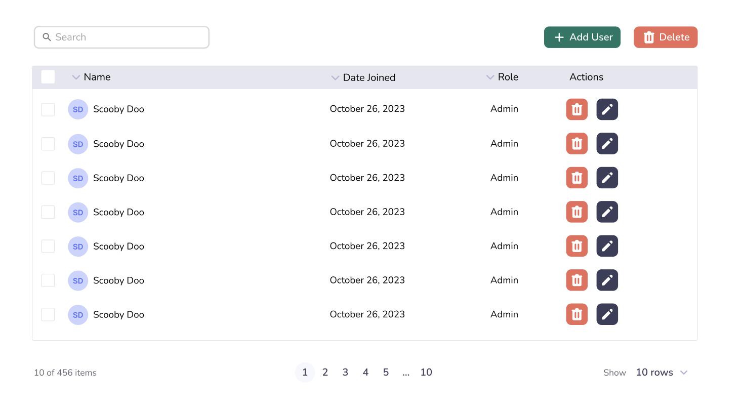
I decide a table with a search bar is a good direction to go. It is a common interface that would be familiar to most people who are acting as an administrator. I mock up something like this:

Tables are capable of displaying a lot of data in a skimmable way. Also, there is a plenty of space for different columns of information if we add new features in the future.
Throughout the process, I’ve analyzed and considered how the structural solution of the table breaks down into smaller components that should also be consistent across the application. Looking at the design, you can see I already have some pieces that lend themselves to reusable and configurable components like the user icon, font choices, search input, checkboxes, pagination, and buttons, to name a few.
There are some things missing, though, in this early-stage prototype. For instance, what happens when a managers begins searching? Does it automatically elimate users who don’t fit the query?
This is also an early design. We should gather data from the users to be sure that this is intuitive enough to use. For example, user testing could show us that the delete at the top should disabled until someone clicks a checkbox (another pattern in and of itself).
How each component is built is dependent on the framework being used and the development patterns established by the application, but the considerations for which pattern to use ultimately remain the same.
Consideration of the audience, context, content, and problem makes for a clear decision making process. Utilizing common components within these patterns helps make an application cleaner and easier to interact with as a user. This, after all, is the goal of a well-designed UI/UX system.